

This week's competing covers are:
The US Cover The UK Cover
 vs.
vs.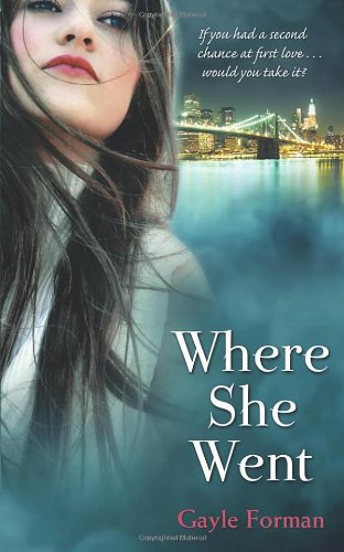
I like the font of the title on the US cover, but other than that, the UK cover is better. I love the city and the Brooklyn bridge in the background as opposed to the foggy nothing-ness of the US cover. I also like how the tagline is "If you had a second chance at first love....would you take it?" It's very fitting for the book.
I agree. I love the US-version's title font (the author font is so lame, though, particularly when contrasted with the title font).
ReplyDeleteUK for sure -love the cityscape!
ReplyDeleteUS, easily. There's too much going on in the UK version that distracts me from the girl. The font choice and placement for me works better on the US version.
ReplyDeleteI've noticed that a lot of UK covers add taglines...guess they think we need extra enticement to read.
ReplyDelete