Showing posts with label cover vs cover. Show all posts

Sunday, February 19, 2012

Cover vs. Cover [15]

Cover vs. Cover is a weekly feature, hosted here, where I compare different covers of the same book. For more information, visit the Weekly Features page.

This week's competing covers are:

           The US Cover                                    The UK Cover
   vs.


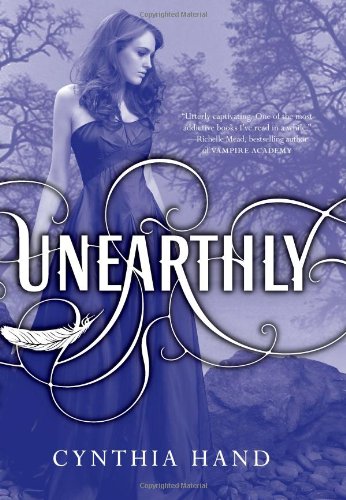
I like the US better. Even though the lilies are cliche, they're pretty. I like the shade of purple that tones the UK cover better than the purple on the US, but overall the UK cover is too similar to Fallen's cover to be the better of the two. What's interesting is that the title text for both is almost exactly the same.

Saturday, October 15, 2011

Cover vs. Cover [14]

Cover vs. Cover is a weekly feature, hosted here, where I compare different covers of the same book. For more information, visit the Weekly Features page.

This week's competing covers are:

           The US Cover                                    The UK Cover
   vs.


US. The UK cover isn't bad on its own, but to me it pales in comparison. I like the faded background with vintage vines and flowers because it really gives the feeling of an old-timey fantasy. I also like the sword and the eye on the blade. But one thing I like about the UK cover is the snow in the background, because it represents a journey that takes place in Graceling.


**On an unrelated note, I'm glad I picked Graceling for this week because I haven't read it in over a year and it's nice to think about it again.

Saturday, October 1, 2011

Cover vs. Cover [13]

Cover vs. Cover is a weekly feature, hosted here, where I compare different covers of the same book. For more information, visit the Weekly Features page.

This week's competing covers are:

           The US Cover                                    The UK Cover
   vs.


US. The UK cover shows one of the binoculars that Liz uses to see people back on Earth, but she stops using them early on so I don't think it's accurate to have it represent the entire book. I also really like the blurry background on the US cover.

Saturday, September 24, 2011

Cover vs. Cover [12] — Double Feature!

Cover vs. Cover is a weekly feature, hosted here, where I compare different covers of the same book. For more information, visit the Weekly Features page.

Because there are two US and two UK covers (and because I loved this book), I will be comparing FOUR covers instead of two!
Here they are:

        The First US Cover                               The First UK Cover
   vs.


The candle on the US cover is mysterious, and I really like the billowing smoke, but the UK cover foreshadows the book better with the lonely heart floating in the water. Though I don't understand why the "for" in the title is italicized on the UK.


    The Second US Cover                      The Second UK Cover
   vs.


Again, the UK cover is the winner. There's nothing wrong with the girl, but the daisy with specifically twelve petals is symbolic and I like both the title and author text. Notice how on the first US cover there's the sticker for the Printz Award, but not on the second.

Saturday, September 10, 2011

Cover vs. Cover [11]

Cover vs. Cover is a weekly feature, hosted here, where I compare different covers of the same book. For more information, visit the Weekly Features page.

This week's competing covers are:

           The US Cover                                    The UK Cover
   vs.


I really don't like the US cover, I think it's too generic (then again, I thought the book was too). I didn't see the UK cover up close until just now, and didn't even notice the seaweed curling around the title text, which I like. I also like the sun shining through the ocean, so the UK cover wins this time.

Saturday, July 30, 2011

Cover vs. Cover [10]

Cover vs. Cover is a weekly meme, hosted here, where I compare different covers of the same book. For more information, visit the Weekly Features page.

This week's competing covers are:

             The US Cover                                    The UK Cover
   vs.


US, definitely. While I like the scene from the book that's portrayed on the UK cover, I can't forgive the cheesy-style art.
But actually, the cover I like better than either of these is the one for the US hardcover:
You know how most of the time when a series starts out with a different cover than the other books, you can't have a matching set if you buy the hardcovers? That really annoys me, but in this case, the Leviathan hardcover is only slightly different from the covers of following books, so if you buy the hardcovers you can still have a matching set!

Saturday, July 23, 2011

Cover vs. Cover [9]

Cover vs. Cover is a weekly meme, hosted here, where I compare different covers of the same book. For more information, visit the Weekly Features page.

This week's competing covers are:

             The US Cover                                    The UK Cover
   vs.


I certainly like the title font of the US cover better than the UK. Also, the book jacket is even prettier in real life than the picture online is, it's all shimmery and foil-y. What I don't like about either covers is that neither have strawberry blonde hair, which was Clara's natural hair color. Then again, the US cover model's hair is purple, so I guess it could be any color you want.
So, while the UK cover is very very pretty (love the foggy forest and light shining in), the US is the winner.

Saturday, July 16, 2011

Cover vs. Cover [8]

Cover vs. Cover is a weekly meme, hosted here, where I compare different covers of the same book. For more information, visit the Weekly Features page.

This week's competing covers are:

             The US Cover                                    The UK Cover
   vs.


Even though I like the laser beams on the UK cover, the US wins by a long shot. It's mostly because Kat is not a blonde (assuming that it's Kat on the cover), though I also like the glasses that reflects the painting. I also like how the US cover model has a more serious look on her face than the UK.

Saturday, July 9, 2011

Cover vs. Cover [7]

Cover vs. Cover is a weekly meme, hosted here, where I compare different covers of the same book. For more information, visit the Weekly Features page.

This week's competing covers are:

             The US Cover                                    The UK Cover
   vs.


I love both of these covers. I love the flowers caught up in the swirling magical-ness on the UK cover. I also love the flowery vines branching out from beneath the cloaked girl and the dramatic lightning on the US cover. I can't pick between these two! I'm calling a tie.

Saturday, July 2, 2011

Cover vs. Cover [6]

Cover vs. Cover is a weekly meme, hosted here, where I compare different covers of the same book. For more information, visit the Weekly Features page.

Heeding to a request, this week's competing covers are:

             The US Cover                                        The UK Cover
   vs.


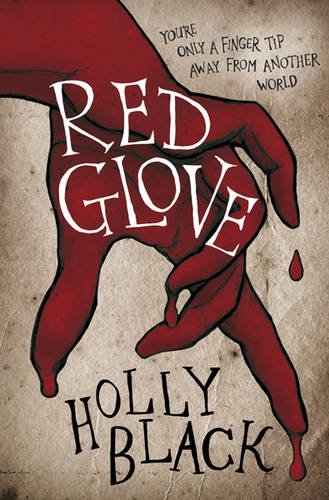
I can't speak for the significance of the covers, because...I've barely starting reading/listening to Red Glove (I know, I know, shame on me!). But the actual book aside, I think I like the UK cover better. I love the deep shade of red that the glove on the UK cover is, it makes the glove on the US cover almost look orange. I also like the title and author font better.

Saturday, June 25, 2011

Cover vs. Cover [5]

Cover vs. Cover is a weekly meme, hosted here, where I compare different covers of the same book. For more information, visit the Weekly Features page.

This week's competing covers are:

             The US Cover                                        The UK Cover
   vs.


It's almost impossible to make a comparison between these two covers, because they're so different. I like how sinister the US cover looks, but the UK cover would have made me want to read the book too. It's a tie!

Saturday, June 18, 2011

Cover vs. Cover [4]

Cover vs. Cover is a weekly meme, hosted here, where I compare different covers of the same book. For more information, visit the Weekly Features page.

This week's competing covers are:

             The US Cover                                        The UK Cover
   vs.


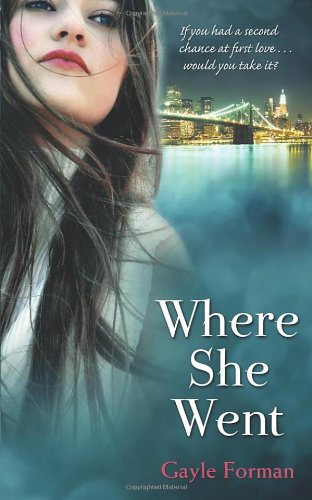
I like the font of the title on the US cover, but other than that, the UK cover is better. I love the city and the Brooklyn bridge in the background as opposed to the foggy nothing-ness of the US cover. I also like how the tagline is "If you had a second chance at first love....would you take it?" It's very fitting for the book.

Saturday, June 4, 2011

Cover vs. Cover [3]

Cover vs. Cover is a weekly meme, hosted here, where I compare different covers of the same book. For more information, visit the Weekly Features page.

This week's competing covers are:

             The US Cover                                        The UK Cover
   vs.


The UK cover model seems to have her back turned to us, but we see her Gallagher Academy patch. Why would her patch be on the back of her uniform? That makes me wonder. But this really is a hard decision. Both covers are cute, and both portray what the book is about perfectly (at least from what I remember. I haven't read this book in a while). I think I'll call it a tie!

Saturday, May 28, 2011

Cover vs. Cover [2]

Cover vs. Cover is a weekly meme, hosted here, where I compare different covers of the same book. For more information, visit the Weekly Features page.

This week's competing covers are:

             The US Cover                                        The UK Cover
   vs.


In this case, I like the US cover better. I like the duct tape, and the US cover model looks more like how I pictured Hannah when I was reading Thirteen Reasons Why than the UK cover model does. The text in the upper left-hand corner of the UK cover seems crammed, and I don't like that. Also, on the other side of the US book jacket, there's a map that has all the places Clay visited marked.

Saturday, May 21, 2011

Cover vs. Cover [1]

A couple days ago, I was browsing Goodreads and comparing different covers of the same book on the editions page. I wanted to talk about my comparisons, and thought of writing a blog post. Then I thought...why not create a meme? Hence, Cover vs. Cover.


Cover vs. Cover is a weekly meme, hosted here, where I compare different covers of the same book. If you want to participate too, it would make my day! Just leave your post link in the comments (if this meme becomes popular, I will add a Mr. Linky). I compare the US and UK covers, but you can compare any two covers you want, as long as they're of the same book.

This week's competing covers are:

             The US Cover                                        The UK Cover
   vs.


Both of these covers are gorgeous, I love the dress Ash is wearing (in both). But my favorite is the UK cover. The color scheme is so pretty, and Ash walking through the forest looks better than Ash curled in a fetal position.

And luckily, the contents of this book were just as beautiful as the cover(s)!