

This week's competing covers are:
The US Cover The UK Cover
 vs.
vs.
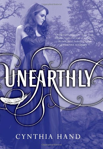
I certainly like the title font of the US cover better than the UK. Also, the book jacket is even prettier in real life than the picture online is, it's all shimmery and foil-y. What I don't like about either covers is that neither have strawberry blonde hair, which was Clara's natural hair color. Then again, the US cover model's hair is purple, so I guess it could be any color you want.
So, while the UK cover is very very pretty (love the foggy forest and light shining in), the US is the winner.
US is definitely much nicer, the UK cover looks too creepy and it's so annoying when the cover image doesn't actually represent the character
ReplyDeleteI bought the first cover model as being a bright redhead. The second isn't close to red.
ReplyDeleteI personally prefer the UK cover I think it looks really ethereal, but then I didn't know the character was a redhead as I haven't read the book!
ReplyDeleteP.S I'm glad you refuse to acknowledge the other Max Ride books too! and sharpie-ing out their names on the covers? wow, that's dedication to the cause!!
The Cait Files
Your blog is legit :)
ReplyDeleteAt first I was like "definitely the US", but after looking at them a bit longer, I think it's pretty neck in neck. They're both pretty in their own ways. The UK one makes the book seem darker than it actually is though.
ReplyDeleteI prefer the U.S. cover. It is sooo pretty.
ReplyDeleteI definitely prefer the US cover as well..although I personally didn't like how shiny it was in real life
ReplyDeleteI prefer the UK cover. The US cover is beautiful. But the UK cover is striking - in an almost creepy way. It stands out to me - even if it's not quite as pretty as the US cover.
ReplyDelete