

Heeding to a request, this week's competing covers are:
The US Cover The UK Cover
 vs.
vs.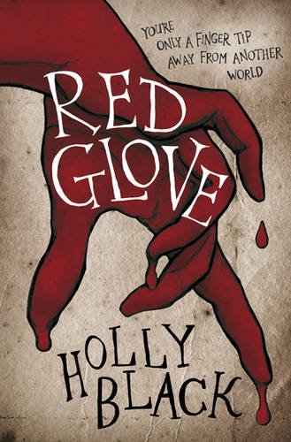
I can't speak for the significance of the covers, because...I've barely starting reading/listening to Red Glove (I know, I know, shame on me!). But the actual book aside, I think I like the UK cover better. I love the deep shade of red that the glove on the UK cover is, it makes the glove on the US cover almost look orange. I also like the title and author font better.
I'm not to fond of either cover, but I do prefer the font on the UK version more than the US one. Neither cover jumps out at me and makes me want to read it, although I do plan on reading this series since my sister said the first book was good. :)
ReplyDeleteOrchid
The Haunting of Orchid Forsythia
I like the U.S. cover better, but that's only because the U.K. cover is a bit too cartoonish for my taste. I like this cover vs. cover post idea though. ^^
ReplyDeleteThey both look pretty creepy. Did you do a cover vs cover for Spellbound? I've seen several covers floating around.
ReplyDeleteI thought I'd say US, but I'll have to say the UK because it's less-cluttered and simple. However, I do like the very normal looking woman on the US cover; it's nice to see that she's not in a dress for a change.
ReplyDeleteThe UK version is definitely more eerie! Thanks for sharing.
ReplyDeleteBtw, Happy 4th of July!